Wednesday, May 14, 2008
Crescent shapes with and without Islamic intent: the Obama logo example

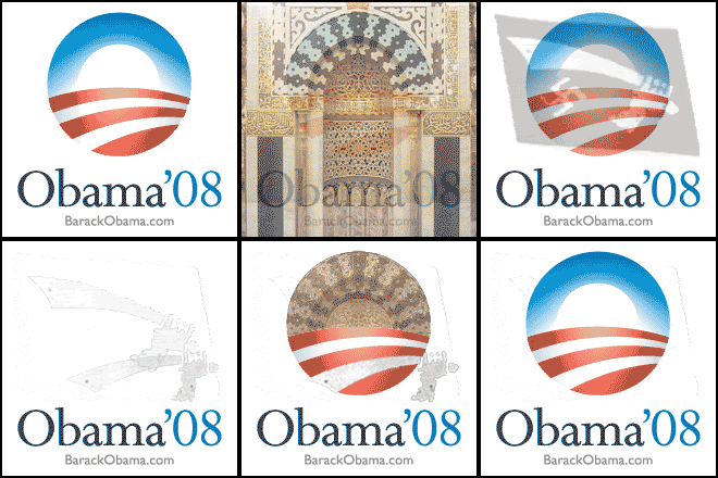
The two most widely recognized symbols of Islam are the crescent and the sword. Kind of amusing that Barack Hussein Obama’s campaign logo can be seen to feature both a crescent and a curved Islamic scimitar:

The crescent shape in Obama’s logo has the round part on top, just like a traditional crescent shaped mihrab (the Mecca direction indicator around which every mosque is built). The animation shows the two most famous mihrabs in the world: the mihrab from the Great Mosque in Cordoba, and the Prophet’s mihrab in Medina.
The lighter vertical column in the center-bottom of the logo, presumably meant to indicate reflected light, even conveys the full vertical shape of a traditional mihrab. The scimitar in the animation is from the flag of the Bosnian regiment of the Nazi SS.
If Obama himself had come up with this crescent logo, one might suspect Islamic intent, given his Islamic heritage. But the logo was not designed by Obama. It was designed by a Chicago based branding firm named Sender, which claims credit for coming up with: “a white sunrise against a blue sky, over a landscape implied by red and white stripes.”
Obama definitely deserves to be made fun of for having a fairly obvious crescent shape in his logo, given his efforts to convince the public that he is not Muslim. This is already an uphill climb, when both his grandmother and his cousin are telling documented lies about their religion, claiming to be Christian in one venue while professing themselves Muslim in another. Lying about being Christian: it’s an Obama family tradition!
Still, there is no indication that the crescent and scimitar shapes in Obama’s logo are intended to convey any Islamic meaning. A genuine coincidence apparently. At the opposite pole is the Crescent of Embrace design for the Flight 93 memorial:

Contrast 1: Architect Paul Murdoch CALLS his crescent shaped memorial a crescent
The Crescent of Embrace name proves that the Flight 93 crescent was and is intended to be seen as a crescent. Only very reluctantly did the Memorial Project change the name, and the changes they made to the design are purely cosmetic. Every particle of the original Crescent of Embrace design remains completely intact in the Bowl of Embrace redesign.
Contrast 2: The Islamic symbolism is overt
It is not plausible that an architect, designing a memorial to people murdered by Islamic terrorists, could be oblivious to the fact that his memorial design is laid out in the shape of a bare naked Islamic crescent and star flag, readily identifiable as a crescent and star flag to airliners like Flight 93 passing overhead.
The Memorial Project simply assumes that the Islamic symbol shapes CAN’T be intentional, which is about like seeing an airliner fly into the World Trade Center and assuming it CAN’T be intentional. Do these people even remember the day they are supposed to be memorializing?
Contrast 3: The Flight 93 crescent contains still further Islamic symbolism
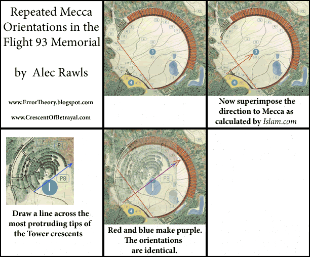
It turns out that the giant crescent points to Mecca. A crescent that Muslims face into to face Mecca is a well known structure in the Islamic world. It is a mihrab (as seen in the above animation), which gives the direction that Muslims are to face for prayer.
Everyone at the Memorial Project is fully aware that a person facing into the giant crescent will be facing almost exactly at Mecca. This according to Flight 93 Advisory Commission member Tim Baird. Again, they all just assume that this MUST be an innocent mistake (the equivalent of seeing as SECOND airliner fly into the Trade Center, and STILL assuming it can’t POSSIBLY be intentional).
Contrast 4: Proof of intent
Paul Murdoch PROVES that the Mecca orientation is intentional by repeating it in the crescents of trees that surround the minaret like Tower of Voices. Below is an animated run-through of the repeated Mecca-orientations (2 minutes).
You can restart the animation by refreshing the page:

Animated GIF: copy and paste. You can email it! (Animation restarts each time email is opened.) Click image for larger animation, if your connection is fast enough (1MB).
Crescent of Embrace site-plan, showing both the central crescent and the Tower of Voices, here.
Contrast 5: the designer's own thematic description is clearly terrorist memorializing
The designers of Obama's logo offer a clearly innocent thematic description of their creation. You can tell just by looking at it what it is MEANT to signify: a white sun coming up into a blue sky over red and white rows of fruited plain. Even the uncanny intimation of the vertical sides of a traditional mihrab is fully explained by the “sun” reflecting off the red and white “landscape.”
In contrast, Paul Murdoch's thematic account of his design is as nakedly pro-terrorist as his crescent and star layout. Murdoch says that the crescent comes from the terrorists breaking the circle. That is, they broke our liberty-loving circle and turned it into a giant Islamic-shaped Mecca-oriented crescent.
As Tom Burnett Sr. put it in his letter to American people, asking for help with our petition to keep the crescent design off of his murdered son's gravesite:
I don’t want to celebrate the terrorist’s circle-breaking crescent-creating feat.And lest anyone thinks that the giant crescent is no longer present, the Park Service website makes clear that, while the redesign looks more like a circle, the circle is still broken:
The circle is broken in two places that mark the southeastern path of the plane to the crash site. The circle is broken at the entry to the memorial and at the crash site.The breaks are in the exact same places as before and the unbroken part of the circle (the crescent) remains completely unchanged. It it still points to Mecca. It is still the world's largest mihrab by a factor of a hundred. The only difference is that now a chunk of the broken off part of the circle is included in the design, which is perfectly consistent with its original terrorist memorializing theme. The terrorists still break our liberty-loving circle and still turn it into a giant Mecca-oriented crescent.
So there you have it. Dueling crescents! Obama’s crescent logo exemplifies innocent coincidence (however guilty Obama may be of lying about his religion). In contrast, the Flight 93 crescent exemplifies proven intent. (More of architect Paul Murdoch’s endless proofs of intent here and here.)

